Our house closed nearly a month ago (we are three days shy) and the first thing I did upon getting the keys was start slapping up some sample paint colors. With the house nearly empty, and with no need to rush the moving process, we decided we would complete the arduous task of painting the entire house top to bottom.
My husband and I just got back from Paris, and we were in LOVE with all the grays.
I knew that I wanted to find the perfect French gray. I wanted a cohesive feel throughout our home, and chose to select a paint palette inspired by our Parisian travels.
Living Room
Aside from the UGLY orange love seat...what was the previous house owner thinking??...the room wasn't bad, though the color was a little too beige for me.
For what I have been calling the "master color" the color that I have used everywhere, in our hallways, and stairwell, as well as the living room, is Benjamin Moore's Revere Pewter (HC-172). This is one of their most popular colors. I usually am not interested in "poplar" and try to avoid "trends" but once I got the sample on my wall, I knew it was the perfect blend of gray/beige. Its not cold at all, but rather a warm gray. I have heard mention that it's a "greeny" gray... I suppose that is just to suggest that it is on the warmer side of the spectrum.
Currently:
Pardon the mess and lack of lighting and furniture. We ordered a couch and chair, which should be delivered any day now.
Dining Room
Before:
Not bad really, but it also was a bit on the colder side. I painted the dining room Benjamin Moore Smokey Taupe (983). It is very similar to Revere Pewter but it has a hint more purple in it, making it seem just a bit more elegant.
Currently:
And you can't really tell that its slightly purple. Trust me. It is. I love it.
In this picture you can see our buffet we discovered in a local consignment shop...I love it! All it needs is a gilded mirror above it. I guess that isn't ALL this room needs...I'm thinking some lovely gray curtains, a dining table as well as finished chairs.
Entry Way
Before:
The yellow tinge comes from the HORRIBLE lighting...I don't even think I took a picture of the BRONZE monstrosity that was attached to our ceiling at emitted FLORESCENT light. (First world problem, huh?)
I wanted gray horizontal stripes, because I am a design blog grazer. I have seen them everywhere and I loved them. Rather I love them. I used Benjamin Moore Dove White (OC-17).
The white greyhound is something I have always wanted, and my lovely hubby found one for me for Christmas last year!
The lamp is there because I got rid of the ceiling lights before I chose new ones. A suggestion...don't do this. Natural light only occurs half of the day...
The bombe chest...now that is a treasure I found at the same consignment shop I got my buffet. It's Henredon. It was a steal!!
I was going to paint it...and from this picture, I almost think I might...but in person its lovely. I'll take better pictures when everything...is you know better.
Library
Before:
Okay, so its not a library or a sitting room. Its a cozy family room off of our breakfast nook. I'm a bookworm and I wanted someplace I could relax without the tv, so this is now our library or sitting room, depending on the day.
We went to Benjamin Moore and I fell in LOVE with a color called Cosmopolitan (CSP-100). Its was a rich pewter. I had to have it. I brought the swatch to the sales associate, and was informed that I had picked the "top of the line." "Of course she did..." my husband murmured as he pulled out his credit card. "Only one room!" He reprimanded me.
Due to some confusion, one of my family members, who helped us paint, went on to begin painting the kitchen the same color...what a LOVELY mistake. We had to get two gallons of the stuff...but like they said, we are the ones living there. We might as well love it.
The pigment in the Aura paint is so dimensional. It goes on so nicely. Really, in this case you do get what you pay for...not that the lower lines of BM are not good. Because I really have loved all the paint I have chosen.
In Progress:
Aww..our little Teddy is asleep on the couch in this picture! The Audrey picture is on its way out, I'm afraid. I don't believe grown ups get to have Ikea pictures hanging on the wall.
Kitchen
Before:
In Progress:
Its amazing how color can change everything about a room. Take for instance the photo of the kitchen. The cabinets look so YELLOW in the first one, because of how brown the paint color was.
Breakfast Nook
My favorite room in the house has to be the Breakfast Nook.
Before:
In Progress:
This one is getting its own entry in a few days. My husband MADE me this carrara marble bistro table. Epic!
Powder Room
The previous homeowners picked an okay blue for their powder room. As you can see above, I will change it if it even seems a little off of what I want. I think I just got overwhelmed and ran out of steam. The bathroom is still as it was...which just wont do!
I actually dont have a picture...and I'm too lazy to take one right now.
Master Bedroom
I wanted a moody romantic bedroom, so I chose to paint it Benjamin Moore Dior Gray (2133-40). In some light it definitely looks purple...like a storm.
Before:
Yikes! I cant believe it ever looked like that!!
In progress:
Its not done...by any chance, but its closer than any of the other rooms in our house. What can I say? We are still newlyweds...kind of.
Master Bathroom
Before:
In Progress:
I probably said somewhere in this very blog entry that some color was my favorite (Revere Pewter or Cosmopolitan...or maybe Hollingsworth Green below), but truly Benjamin Moore Owl Gray (OC-52) is my favorite!! Our bathroom is my favorite room. Even though its tiny. This gray is so gorgeous! I want to put it everywhere with white and crystals and old graying barn wood.
Future Nursery (Hopefully)
Before:
We aren't expecting, and this room is purely for our puppies and future baby. As such...it looks like this.
Currently:
Thats all the lighting we have in this room. Hardly any. The giant black thing is a armoire, which will be used in this room (because its SERIOUSLY lacking closet space). I chose this room as the nursery because its right next to the master and it feels so cozy. I cant wait to work on it.
Guest Bedroom
Prepare yourself. Guard your loins. No seriously....don't tell me I didn't warn you.
....
.....
Guarded yet?
....
....
Better yet go put on some sunglasses.
....
....
No. Really. Sunglasses everyone.
....
....
Prepare yourselves to be horrified.
....
....
I feel like Ryan Seacrest...I can see this is annoying you...but I can't stop because this...
...
...
Is American Idol.
....
....
Okay here you go...
Looks nice with a filter on the camera lense. Imagine it the bulbs being florecent. They were...
Currently:
Much better! Hollingsworth green...the perfect shade of Paris Mint.
Husband's Home Office
Before:
I'm sorry to everyone who likes painting their little girl's room brown...I don't I hate it. Blech!
This will be the future home to my husband (...and our three dogs).
Currently...its a junk room lol!! He gets to work in the dining room.
We painted it Bella Blue however.
Benjamin Moore Bella Blue (720)
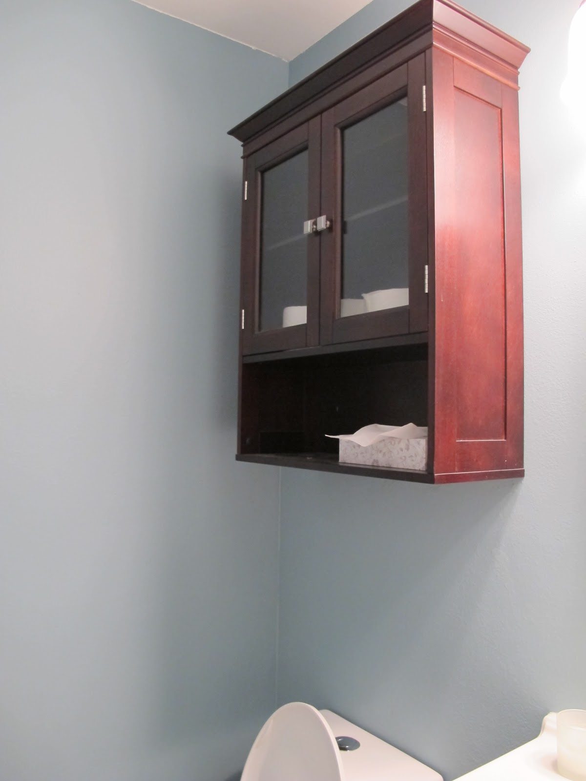
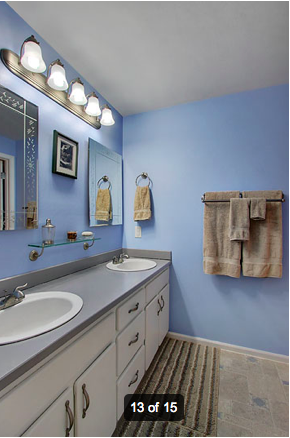
Guest Bathroom
One last room in this home tour, the guest bathroom. I never go in this room. The color...the lighting...its all just bad. This will be the weekend we tackle this thing.
Before:
Currently:
Yep nothings changed...just worse.
Im planning on painting it all Benjamin Moore Palladian Blue (HC-144). Currently there is a lighter shade in the shower area then the sink. Cute. Just really not executed well.
Oh, I almost forgot!!! I repainted ALL the ceilings as well. Benjamin Moore French Canvas (OC-41) was chosen, and its a soft creamy white. It really looks fantastic with all the paint colors, providing a soft low contrast, allowing the rooms to look a little airer and bigger.